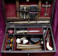
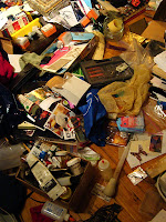
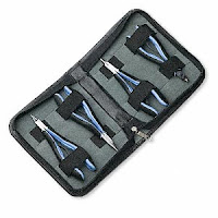
I've often times been asked where I find inspiration for my jewelry design. The truth of the matter is that I find the Muse in almost everything around me. Some of the most mundane objects and scenarios generate great ideas. One of the things that I consider when I sit down to make a new piece is visual language. Visual language is the communication of an idea through seen objects that I, as the artist, create or arrange. It is my goal to create pieces that are easily identifiable and convey a particular meaning. To pick a topic, boil it down to the bare essentials, extract a message, and then translate it into jewelry isn't always the easiest. That's why I utilize a lot of really basic and common imagery and household experiences to facilitate the process. I use my handy digital camera and Google Image Searches to stock my visual archive - literally and figuratively.
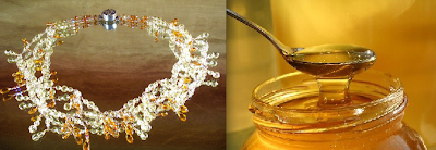
The piece above and to the left is titled, "
Miel." It means, "honey" in most Romantic languages.
Miel was a semi-finalist for 2007 KGI Worldwide Design Contest. I wanted to create a piece that would seemingly drip off the wearer's neck and embody the characteristics of honey. To tie the piece together, I used a bee emblazoned box clasp designed by family at
Green Girl Studios.

I'm not sure who originally said it, but the words still ring true today:
Mother Nature is the greatest painter. I studied painting in college and learned that one of the first technical hurdles is mixing colors. I often times use nature as a direct source of color palettes. "
Ode to Autumn," the piece above and to the left was inspired by the brilliant colors of the fall foliage. The challenge here was finding the right materials to simulate the warm chroma of the leaves. I used a lot of different saturations of the same kind of stone, primarily carnelian, (with sun stone and red tiger's eye accents). To pull the piece together, I used a
shibuichi clasp from
Saki Silver that has its own warmth and richness.

I can remember the first winter I spent in New York. I was cold, miserable, and probably more than a little suffering from seasonal affective disorder. Growing up in Florida, I wasn't used to it
or how spring would make me feel once it arrived! Coming out of months of darkness and freezing temperatures, I was positively giddy! Flowers were blossoming on trees, birds were singing, the sun had come out, and Love was in the air! To celebrate, I took a stroll through Central Park. I was thinking about my newly found love interest and felt all those feelings one sparkles with at the start of a budding relationship, when I came across Cherry Hill. What I saw took my breath away. The hill seemed to be magically transported from some Candy Land and made of cotton candy; it was covered with saccharine pink cherry blossoms that covered it in total. At the very top, near the trunk of the tree posed a newlywed couple in full regalia and wedding finery having their pictures taken. Everything seemed to converge at that moment - the weather, my feelings, the scenery, the symbolism, everything. Years later, that particular love interest has faded into the shadows of yesteryear, but that moment, suspended in time, has not. It still remains vibrant and crisp.
Color isn't the only source of inspiration. Nostalgia is an ingredient that can be added to design. While it reaches into one's own personal imagery, you'd be surprised how many people have shared similar feelings and can relate to, (if not have already experienced) the same or nearly same circumstances.
Sakura, the necklace above and to the left, was featured in the
2008 Summer issue of Stringing Magazine. I didn't use just color and nostalgia to make this piece. Using wire-wrapped links comprised of rondelles sandwiched between pearls and rose-colored Swarovski rounds, I mimicked the shapes of the buds and burgeoning cherry blossoms. Shape is another visual aid in your toolbox to convey what you mean. To emphasis the cherry blossom theme, I galvanized the message with the addition of a silver barrel bead by the talented
Anne Choi and a small flower clasp from my family at
Green Girl Studios.

Inspiration doesn't always follow a straight line. Seemingly random events and images can come together, react, and results in new directions in design. For instance, what do break times spent reading classical literature, a
Dead Can Dance tribute album, and a trip to the Botanical Gardens create? In this particular case,
The Lotus-Eaters featured in the
2007 Summer issue of Stringing Magazine. From the very start, when I could pick up a book and read it, mythology was one of my favorite subjects. It nurtured my curiosity about how the world worked (far better than hard science ever could) and set ablaze my imagination. For the longest time, I would carry a paperback copy of
The Odyssey and read and re-read the epic poem on my breaks in between lawn-care jobs. Eventually I graduated to
Tennyson and beyond, many whom were still firmly rooted in classical mythology. One of my favorite bands is
Dead Can Dance. In 2004 a tribute album came out of their work, redoing and reworking some of their songs. Needless to say, I wore it out listening to it. The album was titled, "
The Lotus-Eaters." A few years later, I found myself at a Botanical Garden and seeing a luminous pale green flower emerging from muddy pond water. It seemed to be a pure and shining example of sheer beauty. Not long after that I was at a bead show perusing
Marsha Neal Studio's booth. I honed in on the ceramic pendant with the lotus image on it and everything clicked into place, and suddenly everything buried in my subconscious surfaced and manifested in a design.
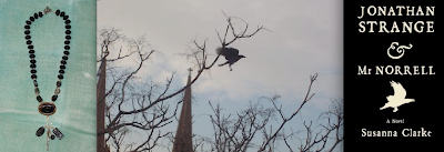
The process of making, "
The Raven Queen," (which was also featured in the
2007 Summer issue of Stringing Magazine), happened a bit reversed from that of
The Lotus-Eaters. I had all the components. I had the ceramic raven pendant from
Raven's Journey. I had the twig charms from
Scattered Light. I had all the stones. I had the clasp from
Saki Silver and I even had the ceramic piece from
Marsha Neal Studio. But all of them rested in my bead stash independent of one another. That is until I started reading
Jonathan Strange and Mr. Norrell by Susanna Clarke. When I looked out the window, taking a break from reading, I saw a HUGE raven outside my window that had alighted in the branches of the dead tree. I grabbed my camera, ran to the window and caught the bird just as it took flight. The rest fell into place, even the eventual gender change of the original title of, "
The Raven King" to "
The Raven Queen."
Inspiration is all around us. It's up to us, as designers, to utilize our creative toolbox to harvest the gifts of the everyday Muses.
 So, I've been clearing out my studio and have found some really cool things, but either have ten of something, won't ever use it, don't know how to use it, or simply thinks it belongs to someone else who will better appreciate it. I have my heart set on finally killing off some of my credit card debt. Ring in the New Year on the right foot and all!


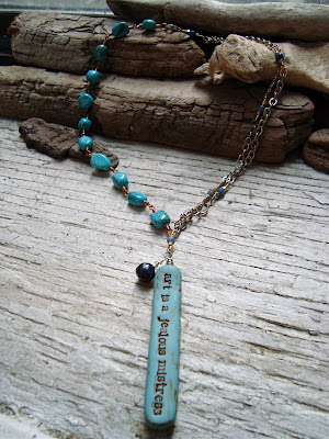
 One of my favorite bead artisans is
  I've spotlighted another poetry barrel bead by


 The piece above and to the left is titled, "
 I'm not sure who originally said it, but the words still ring true today:
  I can remember the first winter I spent in New York. I was cold, miserable, and probably more than a little suffering from seasonal affective disorder. Growing up in Florida, I wasn't used to it
 The process of making, "


