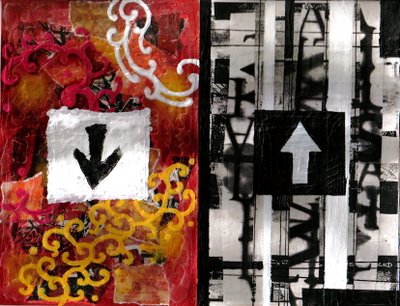
In approaching this week's challenge, I took a more conceptual route. On the left side, I wanted to embody a more expressive and organic style. I tried to eliminate hard lines by only tearing the background papers and not using rulers or straight-edges. I also made an emphasis on color and more flowing pattern. This side is also significantly more textured.
On the right, I wanted something harder and more analytical. The lines are much more sharp and severe. I implimented a black, white, and gray color palette to draw further distinction from the other side. I've also incorporated a patterned text to make it seem more "word-oriented" as opposed to "image-oriented" left side.
The arrows drive home the idea that these two sides are going in different directions. They are polar from one another.


8 comments:
wow, that's a lot of work! great idea, and thanks for visiting my site!
Interesting take on this weeks theme! Very nicely done!
very nice concept, good reasoning and execution. one of my favorites.
great work! I like the graphic elements in both pieces, what a great way to tackle the theme!
I like the way how you take on the theme!
I love the visual contrast, and I love how you've explained your underlying concept. This is such a great combination of concept and image...well done!
great contrast and work!!!!! love it
i like it! it reminds me a little of how the brain works, you know, left and right hemispheres, one dealing with rational thought, writing, measuring, etc and the other dealing with imagination and abstract thought.
really well done!
Post a Comment