
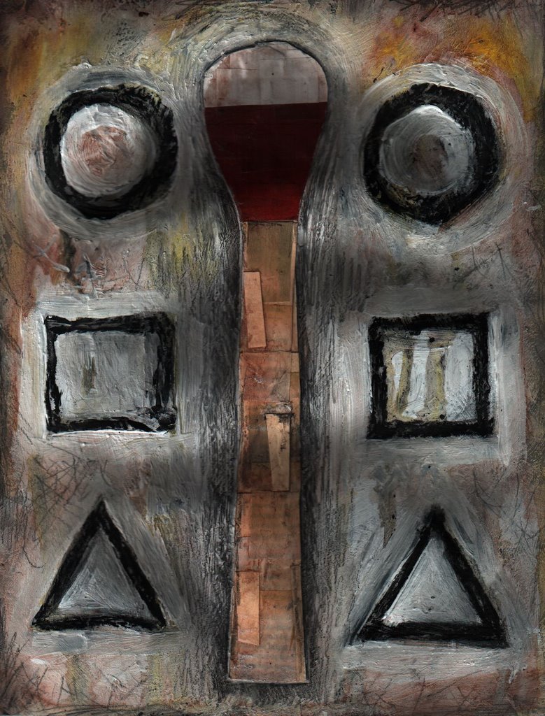
For this week's theme, I wanted to do something much more simple and direct. Visually there are a lot fewer elements, so I wanted to focus on the subtle things like texture. I built up a surface of plaster and charcoal and then collaged the central figure of the match. I then took gesso and absorbant ground and created the matching shapes. The shapes remind me of that game small children play with different shaped blocks where they have to try and find a matching hole to put them in. Afterwards I did scratchy drawings with graphite and then covered them with white. I alternated between washes and pencil strokes, broke pieces of charcoal, and even actual matchestick heads.


8 comments:
Applause; enjoy the boldness; wonderful layers
strong shapes and texture. nice piece.
I love the luscious layers you've built here. Makes me wish I could see it in person. Beautifully done!
That's really really cool. And thanks for the description of how you made it.
Well done! Love the energy and the very personal feel to this.
it's great!! it allmost makes me want to touch it!!!...wonderfull!
Wow! This has such fabulous texture! I'm so glad you posted it large so we could see the texture, the dimensionality, and the scratchy drawing. It's a fine composition that derives its power form that combination of simple shapes and limited color with rich textures. I like!
Yeah, the texture is what really makes this work. Otherwise, it'd be way too plain. I think the shapes on teh side add an interestiing element to go with your interpretation of the theme. Thanks for the comment. :)
Post a Comment